Current Colour Trends

Current colour trend - brown paper stock with white and green. I like this trend, I think it shows a humble brand. It also carries a subtle environmental message which fits in with our current climate as well.


Green and blue combination's are everywhere at the moment, as companies are jumping on the 'eco friendly' bandwagon. The obvious colour combo of green for growth and nature mixed with blue for water and the sky is being used on anything from logos, websites, packaging, photography...anything that can mean 'saving the planet'

I think it will start to get boring and cliche very quickly, and I think designers should get more creative in their eco friendly applications. I believe that everything we design from now on should consider the environment as a priority - eg designing for less consumption, more recycled materials, less waste, less transportation etc. So it doesn't need to be obvious anymore!! You can still make a beautiful black stylish logo for an environmentally conscious company. It doesn't have to be a handrawn blue and green cliche brand!
Colour blocking is also a trend I have been seeing a lot of lately, using simple blocks of colour matched with paired down typography to differentiate between flavours or varities. I think it works well but I also think the packaging needs to be special in some way otherwise the brand could loose its shelf presence.
Ok the next trend I have noticed is printing on brown paper stock so that your colours are desaturated and browny looking. I like this use of paper to control colour, I think it adds another dimension to a brand and looks cool.
Patterns and colour have also been big this year, like this designer Evian bottle. Happyness and optimism to get us through the bad economic times! I love the colour bands on this water, i would definitely buy it.

More brown paper stock. Beautiful, subtle colours.

Fluros and Discords


Discords and fluro colours can work well - but can also be an assault to the eyes. Somehow I think MIA's album cover 'Kala' is both an assault and a joy to my retinas. Good job MIA!

One example of a discord is when colours are taken out of their usual tonal range...for example using a light purple with a murky green....green is usually lighter in colour than purple, however once a tint of purple is compared with a shade of green they are taken away from their usual context and the result is spectacularly awful to the eyes. Add a bright red in the mix and you've got a powerful discord.

But why would anyone ever want to create such a monster? Well I suppose the colour combination makes you feel uncomfortable so perhaps designers could use discordant colour combos when they are doing political posters - making the opposition look gross? I don't think I would personally ever need to use them, making gross colour is never really an aim of mine!


I tried to make the discord combination look good by breaking it up into a pattern. I find patterns are a great application of colour and it does improve the colour combination slightly, but you can't really fix that green...

Discords are also when intense bright colours are used next to each other and they create a weird occurance in your eyes, where your brain is trying to balance out the competiting colours and you get sore eyes from looking at them. Andrea Innocents poster (above) delibreatelt uses discord colours to create a crazy and intense colour affect with this poster. I have the original poster on my wall and it actually hurts my eyes if i stare at it for too long! As her illustrations are often of weird and unsettleing imagery I think the discords work well in her art.
This is a discord I added into my Colour in the Commercial Environment assignment. I wanted to use a bright eye catching background colour that attracts the eye. It looks a lot brighter and more vibrant in the printed version and as I am appealing to children I think the clashing colours suit the design.
"Fluorescence is the emission of visible light by a substance that has absorbed light of a differing, usually invisible, wavelength. " (wikipedia)

They are colours that project their own light source out, making them the brightest upon bright of colours. They can be used very well in makeup, highlighter pens, face zinc, street signs, safey vests and lift jackets, but I don't like fluros in clothing. At all.

Beautiful example of fluro colours in makeup. They give a new meaning to colour


ewwwwww...... please don't ever wear fluro clothing. Yuk. Does not match anyones skin tones, makes you look washed out and makes you look 5 years old.

Colour Experiment 2 - Paper stock and colour

I have been doing a lot of printing this week in preparation for my portfolio, and I have been paying particular attention to colour correction throughout this printing process.

This is the blue labels I have been making for a packaging assignment. I blue colour I used for the brand is a beautiful grey blue, it looks like a frosted sort of pale blue colour and it works really well for the iceblock package.

I had already printed half of the label out on plain paper, but I need to print one section out on sticker paper to use for the front. The paper isn't cheap and I was so disappointed when my first print (above) produced a completely different colour than my first print out!

The blue is so plain you can hardly read the label and it looks so different you'd think I had completely forgotten about the colour choices at all!
To fix the problem I had to do some blue swatch test prints on the sticker stock, and eventually I found that the bright, deeper blue printed out a similar colour to the plain paper.

The top image above is the original file I used on plain paper and below is the new blue I had to use to print on the sticker paper. It looks really really disgusting, but have a look at the results....

Yay! The two blues on the different stocks are almost identical. This process took a while but it showed me how important colour is and how much it can vary between paper stocks. If I had been lazy and just settled on the first outcome, my branding would have suffered and the colour would have been inconsistent.

Colour Experiment 1 - World Wide Fail


One of the most frustrating things about being a designer is colour differences in printing. Above are 2 print outs of the same digital file, the one on the left is from World Wide, the one on the right was printed on my home inkjet printer.

One I completed the test prints at home I was happy with the matte, soft and evenly toned colours produced, so I brought the file into World Wide to print it on a3. I was so shocked and disappointed with the results! The red is far too dark, the colours are mismatched and the background grey is murky and uneven. Why does digital printing suck?

In order to get the images the correct colour, I should have done a test print, and then adjusted the artworks to have less red and a lot lighter. But who ever has time to test print ?!

Worldwides printers also produced different colours each time they print as well, so it's very difficult for uni students to control the colour they want. Probably the most heard complaint when handing assignments in is "Argh the colours printed out so wrong!"

Inappropriate Colour

Brown and yellow together is always inappropriate! Yul, what a awful combination of two colours. Definitely use a third colour if you must use brown and yellow together (god forbid)
Looking very 70's retirement village with the brown and yellow
Oh Australia, murky green and bright yellow together? Appropriate for the occasion but I really dislike those two colours together, they seem so old fashioned. Could they not have lightened that green up a little? Good proportions at least...I'll give the uniforms that much
Everything about fluro colours coming into fashion last year was sooo inappropiate. Yuk yuk yuk. Still have not seen a single person who can pull of fluro colours! They are too bright, in your face and do not draw attention for the correct reasons!


Yuk. Pink and yellow. Why?
Why are none of these recycling bins green!!!!!!! The yellow is such a fluro bright tone it looks like radioactive waste should go in there, the red looks like dangerous materials, but the blue fits in well with the paper. I think they should have used green for the glass and bottles and white or silver for the drink cans. Would have been a much clearer message

Fabulous Colour!


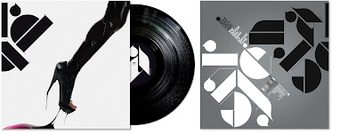
Love the subtle pink used with the strong black and white imagery in this Non Format Record cover design.
Fabulous use of lighting, creates beautiful fun colours at an MIA concert

This is an assignment I completed at the very start of semester whenI had just begun my colour class. I paid particular attention to my colour palette throughout the assignment and I think the colours and proportions work really well.

How can you not use fabulous colour when designing a walking guide book for Brisbane! I love that our city embraces bright colours, apparently in Melbourne people look at you funny if you wear really colourful clothes...how do they live!?

The beautiful Southbank Arbour flowers in bloom, gorgeous purples and pinks stand out against the blue sky.

All colour is fabulous in its own way, and there is no such thing as a bad colour, only bad use of a colour. As colour is soooooo subjective, fabulous colour all depends on the proportions, the colours around and the application of the colours as well. It's a lot to think about from a designers shoes but I think this class has made it easier for me to pick successful colour palettes.

Tints and Shades

The diagram says it all really...tints move towards white...shades move towards black!
The dark stockings is literally shading this models skin, making it darker to match the dress
Shadows in photograph also "shade" colours.
Tints are used commonly in annual reports, or in 2 colour print jobs as they create different levels of highlight but still in the one colour. If you used another colour to show the different columns in this table it would be too overpowering and the simplicity would suffer


Annual reports love to use tints.

Tints are very handy when designing large amounts of text, they help differentiate sections whilst still retaining the colour selection. Shades work well in this sense as well, but can be more dominating and doom and gloomy. Not as happy as tints!