
 Analogous colour diagram - colours that are in the same range on the colour wheel. Above diagram shows orange through to light green - just like the citrus fruit example below!
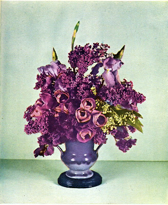 Purples, pinks, blues and green - its a large section of the colour wheel but I feel it still is analogous as the colours blend well and are all cool.
 Analogous colours sit next to each other along the colour wheel. For example, blue aqua and green together are analogous. When used in design, analogous colours blend well together and are good for create a united colour theme.
The flaws of analogous colour schemes is that they usually don't have much contrast in colour, so it could look a little washed out, even have a rainbow look.
The analogous colour use in the poster above really gives it an islander feel. The way the colours melt into each other creates a delicate harmony as well.


