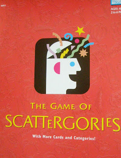

 To me, the red version of this identity not longer communicates friendly, as red as many strong negative associations such as anger, blood, death etc. It also looks more mature, more erotic...words like love, passion and danger also come to mind when I think of red. The red doesn't match the casual and rounded typography either...which is why I have concluded that orange is better when you want to communicate friendly, relaxed, fun or you are aiming towards a broad target market and you don' want to exclude anyone!!


