Split Complimentary


This colour scheme uses one colour paired with 2 colours on the opposite side of the spectrum, but on either side of the direct complimentary. The result is still visually contrasting like complimentary colours, but looks more mature and less in your face.

Grey


Metallic colours show class and expense, such as these wine bottles. Gold foiling is an expensive printing technique but it pays off when you want to show quality or make something seem rich.


Brown


This pink works well because it is highly saturated, verging on fluro but the packaging style is bold and graphic which compliments the pink colour.


I like how the designer has used different shades of pink in this card game. The pink is not over powering, or girly and I think this is due to its under saturated colour.

Colour Blocking


The colours in this olive oil packaging work really well as a whole and separately to define each variety...I love the way the pattern subtley adjusts for each label. Fabulous colour!


I also like this example of using colour to define flavours in a range of chocolates, the beautiful contrasts of colour and pattern give them a great shelf presence.


Colour is extremely important to get right in packaging - especially with food, or products with different flavours. When choosing between different varities of soft drink or cleaning products, I often judge the product on colour first, then I read the label second.

Neutrals

Neutral usually means without color. Neutral colors such as beige, ivory, taupe, black, gray, and white appear to be without color, and yet in many applications these hues often have undertones of color. Neutrals are very sophisticated and work well in textiles and interiors as they are not bright or dominating colours that you will get sick of. I believe they are mature, adult colours because the subtle shifts in colour between neutral swatches is only recognizable to the trained, adult eye. Children would not be attracted to, or relate to neutral colours, which is why they appeal to an older target market.


Neutral make up is browns, tans, whites and charcoal colours that have l0w saturation. They look mature, understated and modest.


Neutral colours in fashion are mature, sensible and sophisticated. Layering of neutral colours looks great and makes it more unique to wear.


1970's styled photography and fashion is very in at the moment, and due to the low saturated style of the 70's it mean more neutral colours are entering our design scope. By using neutral colours in their photographs it makes the images look old and faded, just like a genuine vintage shot.

Typographic stickytape- in neutral colours.

Is Orange Better?


To me, the red version of this identity not longer communicates friendly, as red as many strong negative associations such as anger, blood, death etc. It also looks more mature, more erotic...words like love, passion and danger also come to mind when I think of red. The red doesn't match the casual and rounded typography either...which is why I have concluded that orange is better when you want to communicate friendly, relaxed, fun or you are aiming towards a broad target market and you don' want to exclude anyone!!

Orange


Orange is my favourite colour to use when designing. The reason I love orange is because it's super friendly, it goes well with other bright colours, it's vibrant and 'colourful' but still warm and pleasing to the eye. It doesn't exclude anyone I feel.

For example: The above identity for a recording studio feels inviting, relaxed, casual, friendly, reliable and fun. However, different connotations occur once I turn the orange into a deep red. (see next post)

Analogous

Analogous colour diagram - colours that are in the same range on the colour wheel. Above diagram shows orange through to light green - just like the citrus fruit example below!

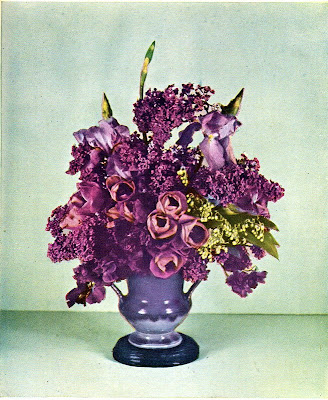
Purples, pinks, blues and green - its a large section of the colour wheel but I feel it still is analogous as the colours blend well and are all cool.
Analogous colours sit next to each other along the colour wheel. For example, blue aqua and green together are analogous. When used in design, analogous colours blend well together and are good for create a united colour theme.

The flaws of analogous colour schemes is that they usually don't have much contrast in colour, so it could look a little washed out, even have a rainbow look.

The analogous colour use in the poster above really gives it an islander feel. The way the colours melt into each other creates a delicate harmony as well.

Chrome


Not using colour in these industrial design sculptures works well- it gives them a high class, expensive feel. Looks like they could be sold at Top 3 by Design. Chrome reflects colour, it doesn't really possess colour, but I think it's still relevant as by not using colour the artist has added more value to their work.