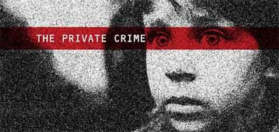


 This is a direct mailer I made for the NAPCAN for an assignment. I used 2 colours to make is more depressing and bold, I think it gives it a more urgent and serious feel.
 I think one and two colour print jobs are really fun to design and it forces you to get creative with the type and the applications of each colour. Tints and shades of colours are useful when designing with 2 colours.


